The project was to rebrand a pair of film companies, one of which was a sub-brand of the other. They had been operating with disparate identities:
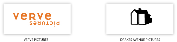
Original identities, before rebrand
The decision had been made to make explicit the interrelated nature of the two identities. Therefore companies needed a way to have two distinct but visually related identities, and also keep the text version of the Verve Pictures logo, as a common thread through the process.
During a brainstorming meeting I made one of those simple, happy discoveries that all designers dream about:
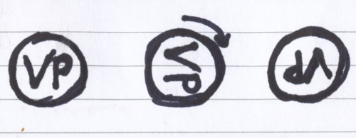
I extrapolated this idea to an identity system of text and buttons, and carried it through to a website identity that covered both brands and added a tagline:

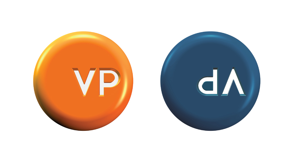
And a little later, a need was identified for some more solid, 3D buttons, so I made these: