A friend of mine (Mr. T. A.) has a son (Mr. H. P.), 11, who sent me some logo designs and asked for evaluation and advice on his career. This is my reply:
Good afternoon/evening/morning/night/dusk/twilight* Mr. H.P. *delete as appropriate
Here are my thoughts, and some advice from someone with 20 years at the coal face of commercial graphic design, and the false arm, wooden eye, and prosthetic cortex to prove it.
1) First of all, let me tell you how impressed I am that you are interested in a career in graphic design. Admirable. You might want to consider something a bit easier and more reliable though, like advanced astrophysics, crab fishing in the Bering Strait, or wrestling bears for tips outside a Russian bikers’ bar.
2) OK, onto the designs which your associate, a Mr. T. A., sent for my perusal. I have perused them. Consider them thoroughly perused.
3) Now, I would always first of all, before putting pen to paper, check out the competition. I did a bit of searching for naturalist organisations around the internet, and after a worrying few hours looking at naked people, I corrected my query and found mostly a distinct lack of logos. Normally a photo of an otter or some such, and some plain text over the top. This has led me to the conclusion that naturalists are to graphic design what Tuareg nomads are to building snowmen.
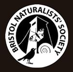
4) I did find one or two that interested me. Here’s one for an organisation from my own fair shores, that of Great Britain, your motherland and home of your erstwhile Queen of the Realm (OK, it might have been a king back then. Whatever.):
Now, it might not mean anything to you, but that tower thing, it’s part of a famous suspension bridge, called the Clifton Suspension bridge. Totally recognisable to anyone in the Bristol area. Now there’s an idea. I know about as much about the Pacific Northwest as could be written on the back of a newt’s eyelid with a blunt twig, but I’m sure you must know something about the place, living there as you do. Are there any landmarks? I know you live in America, and so your history only stretches back some 47 minutes or so, but surely the folk around abouts have managed to erect some sort of semi-permanent monument or structure?
Maybe. Or maybe not.
But if so, might be an idea to include some sort of simple representation of that in your logo. Or maybe not.
5) When physical things elude you, maybe try and work some or all of the initial letters of the organisation in there. I notice you have some representations of hills and trees in your logos. If you kind of squint and look through your eyelashes a bit, the letters NW kind of looks a bit like some hills and forests. (Believe me, it’s a lot easier to do this stuff when you’re old enough to drink alcohol.)
6) I see you have referenced mountains and trees in your logos, which is good, I understand you have a lot of those, and it might be remiss of you to ignore them totally. But can you make it somehow *more* than trees and mountains? The things frequently touted as the best logos** normally have something else going on than something you see at first glance. You know about the Fed Ex logo, right?
Yeah, that one. Just says Fed Ex. Rubbish. A monkey could have done…. HANG ON WAIT A MINUTE THERE’S A HECK DARNED ARROW IN BETWEEN THE E AND THE X. BLOW ME DOWN WITH A FEATHER…. that, my friend is what in the design trade is called a “smile in the mind” – something that makes your brain go “oooh, yeah baby”.
That’s what a great logo is. Now I know you’re only 11, and it might be a bit soon for you to create something that iconic. Frankly if you do, I’m hunting you down and throwing you straight into a ravine – I don’t need that level of competition.
But it’s always good to try and combine ideas, whether it’s:
a) trees and mountains, and the letter shapes
b) an animal or bird maybe
c) something locally recognisable
d) water, earth, leaves, nature
e) Spiderman punching an otter in the face
… OK, maybe not the last one.
7) I find the only way to properly explore these things is to sit down with a pencil and paper and scribble. It’s different for everyone, but for me, all the halfway decent logos normally come this way. Sometimes sitting at the computer can be a bit distracting, and before you know it, it’s 5am, and you’ve created an amazing photo-realistic visualisation of the moon being imploded by a swarm of aliens. And also you sometimes find yourself being restricted by what the digital tools try and make you do. Somehow sitting with a pencil in a quiet space forces you to do something simple, which a good logo nearly always is. Just play with it, doodle, you might surprise yourself, I often am.
8) All the logo examples you’ve done are in one straight line. However, generally, you want to aim for your final logo to be about twice as wide as it is high. So maybe put the text on two lines? Or underneath. Having it all in a line like that might make it tricky to use in the real world. You might find it squashed into an unreadably small sliver like a sardine in a can.
9) Fonts. This is, like, the hardest thing in the world. If Isaac Newton had as many fonts to choose from as we do now, then the Principia Mathematica would never have been published. He’d still be debating the merits of a modernist sans over an art deco flared serif. Torture. Generally though, for a logo, think: SIMPLE – often your logo is going to be shrunk down to something the size of a gnat’s rucksack, so the text needs to be CLEAR. I’d advise against using Onyx for that reason – it’s all narrow and spiky serifs everywhere like a porcupine riding a unicorn and carrying a durian fruit. Ditch that son of a gun.
10) What’s with the line next to the tree in 1.1-1.3? Is that like, a totem pole? A snake with rigor mortis? Hey, maybe it’s some local landmark I’m dissing. Don’t shoot the messenger, cowboy. But hey, if you move that boy over to the other side of the tree, you’ve got a letter N. But you should also think about – what is that? Why is it there. And if you can’t think of a good reason, lose it. As Mark Twain said (about writing, but this also applies here) “If in doubt, leave it out.” Maybe it wasn’t Mark Twain. It might have been Ernest Hemigway. Or it might have been me. Anyway, wise words, live by them.
11) The mountains look like an upside down W. Just saying. You meant that, right? Clever. Hey, keep that up, and you’ll find yourself at the bottom of that ravine.
12) You get the idea though. “Only connect”*** is another useful bit of literary advice. How can I connect these ideas together. Could you for example, make your mountains also look like a bird. Like this:
m
^ look! a bird! Hey, here come some more:
m mmm v mmmmmm mm v v v
mmmmmm v vv mmmmmm
mmmmmmmmmmmmm
…
AAAARGHH!!! RUN!!!!!
13) Anyway, that’s it. All I have to add is keep trying. A secret: every designer feels like they suck, most of the time, then suddenly you hit on something amazing and you feel like you can do anything, until the next job comes along. Perseverance will always lead to inspiration.****
Also, stay away from Englishmen and ravines.
Yours faithfully, your friend,
Mr. Karl Sinfield.
of New Mills, England.
** Notice I use logos there – not brands. A company’s brand is not just the headed paper, it’s how it does everything it does, from hiring employees, to serving customers. You might want to correct Mr T. A. on using that term flippantly to mean just visually designed items.
*** Mr. T. A. will probably try and tell you that was said by E.M. Forster or some other fusty old English dude with a moustache, and maybe he did. But I also thought of it, and I’ve got the computer. So, chew on that Forster.
****Except when it doesn’t. Then just cry and tell them a wombat ate your homework.


